
Accessible Ordering
*Presented at 2019 World Information Architecture Day in Atlanta
Overview
Problem/Motivation
The problem area of focus is making Schlotzsky’s online ordering platform more accessible to a wide range of users, including those with vision impairments, and integrating the design within their main website. This project is in collaboration with Focus Brands, the parent company of Schlotzsky’s.
Users
The target user is anyone who is interested in ordering Schlotzsky's online through a desktop or mobile interface.
Logistics
- Duration: August 2018 - December 2018
- The Team: James, Rishma, Shubhangi & Tanuja
- My Role: Inteviewing, Sketching, Low and High-Fidelity Protoype Design, Report Writing
Research & Results

Exploratory Research
Due to the fact that this project is in collaboration with Focus Brands, we have access to some of Schlotzsky’s user data. This helped up to understand the user base and crafting personas. We extensively researched the Web Content Accessibility Guidelines (WCAG 2.1). These standards included specifications relating to color, contrast, fonts, text, size, ease of use, information flow, structure, and position. We completed a competitive analysis with other products in the market as well as products which are not in direct competition but share similarities with our product. We performed a thorough task analysis to understand the task flow and information flow of the ordering platform.
Automated testing tools ≠ accessibility
Task Analysis
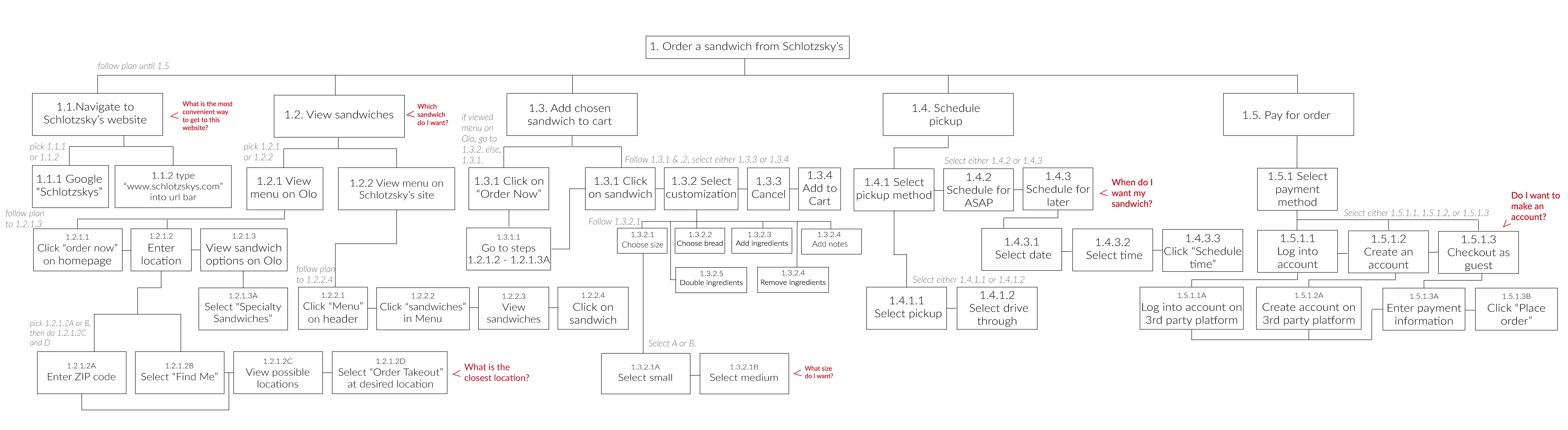
We conducted task analysis to understand users’ goals when they are ordering from the Schlotzsky’s website and how they are able to complete their goal on the site. Conducting task analysis also allowed us to catch navigational issues on the website and understand the navigation process at a more granular level. Performing a task analysis provided us with a baseline for the interactions with the system which helped inform our interview questions and direction with further research methods.
Cognitive Walkthrough
Our goal for performing a cognitive walkthrough was to understand the user’s expectations and information needs while ordering online from Schlotzsky’s. Although we conducted a task analysis to analyze the steps a user would to take to complete a task, we chose to conduct a cognitive walkthrough as well because the process gives us an understanding of the of user’s expectations throughout the navigation of the website.
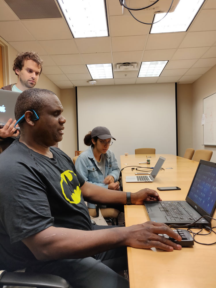
Interviewing / Think Aloud Testing
The goal of this user research method was to get insights into Schlotzsky's online ordering process. We wanted to understand strengths and weaknesses within its interface from the perspective of a consumer. We also were interested in examining if different aspects of the interface that seemed problematic to us based on our task analysis led to issues for all of our participants or specific subset of users. In addition, we asked more general questions about users’ online ordering preferences and habits to help us develop a baseline to understand their experience with and perception of online ordering platforms in general.
Interviewing was chosen as way to gather rich qualitative data relating to understanding the usability and perceptions of Schlotzsky's current online ordering. This method enables us to elicit specific information that may otherwise not be collected from a method such as observation. It also enables us to get a baseline of data collected for all users that can be used to compare and groups users into categories during analysis. We decided to pair Interviewing with think aloud testing to help fill in the gap of what the users experience throughout the ordering process. Think aloud testing is excellent for capturing intentions and reasoning as users goes through the ordering process, which is critical for identifying recurring issues within the interface.
We interviewed a total of 13 participants that we gathered through convenience sampling but fit within target users based on data provided by Schlotzsky's.
There were the following four phases within an interview:
- Introduction - Introducing who we are, the topic of study, confidentiality of data
- Pre-questions - Perception, familiarity, and habits pertaining to online ordering
- Think aloud testing - Observing and capturing data related to experience during process
- Post-questions - More specific data of experience and challenges with interface
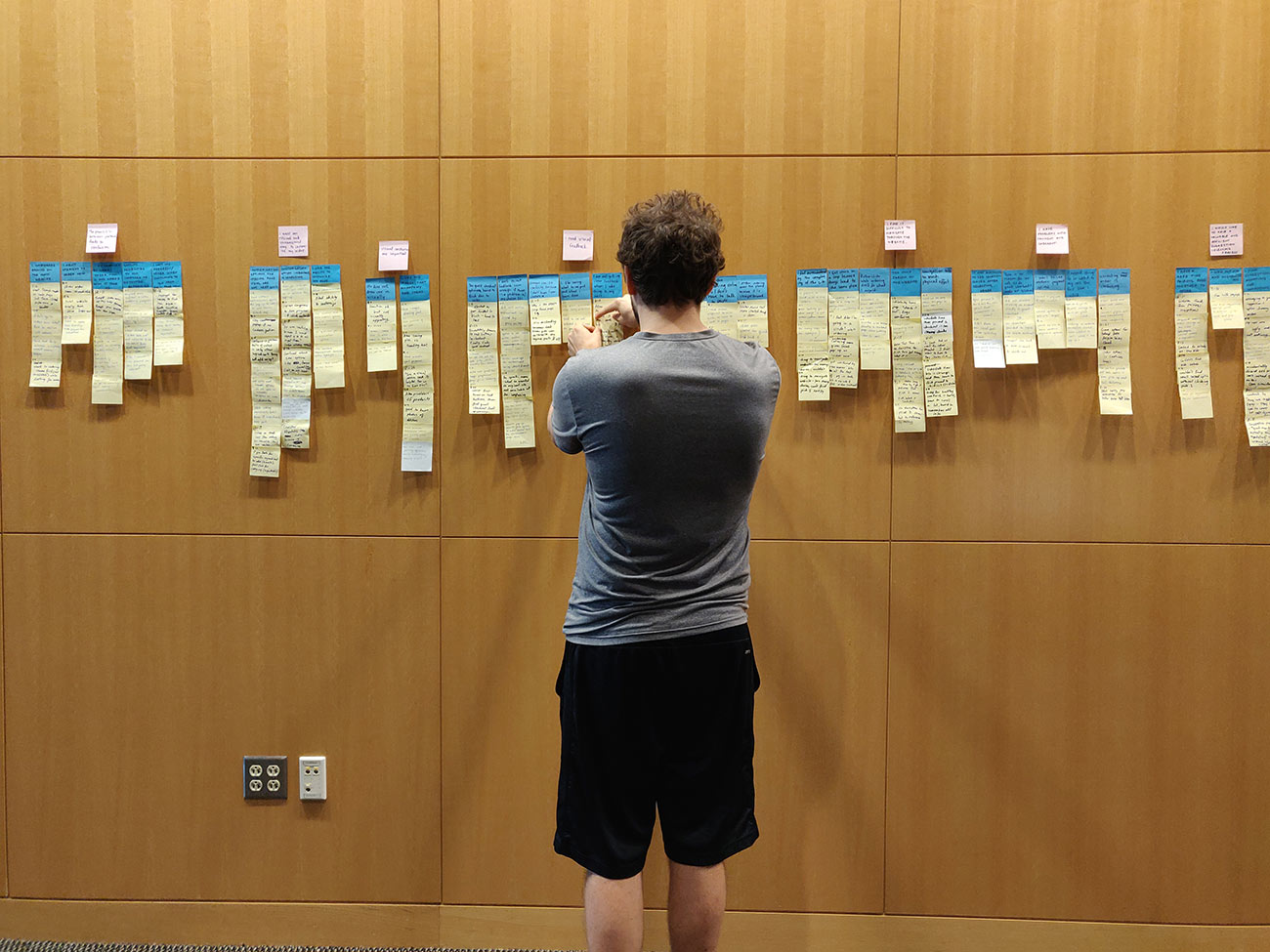
We took detailed notes on all interviews and then converted participants data into a total of 170 sticky notes in order to perform affinity mapping. We then eventually grouped our stickies into 37 blue groups and then groups these blue groups into 10 overarching categories designated by pink stickies. This process allowed to identify common themes that our participants while navigating the ordering process.
Competitive Analysis for Accessibility and Usability
Here, we wanted to get a baseline of accessibility for Schlotzsky’s competitors’ websites and online ordering processes. Using automated accessibility testing tools we conducted testing on the homepages and online ordering pages of Schlotzsky’s and several of its competitors suggested to us by our industry partner. Through the data obtained about the accessibility scores, we got a good idea of how other online ordering websites compared with Schlotzsky’s in terms of accessibility. We can take note of any differences (if any) amongst the websites rated highly and see if we can incorporate them into our design alternatives. To take this one step further, we also conducted a task analysis of the online ordering process for the most accessible website among all of the competitors examined.
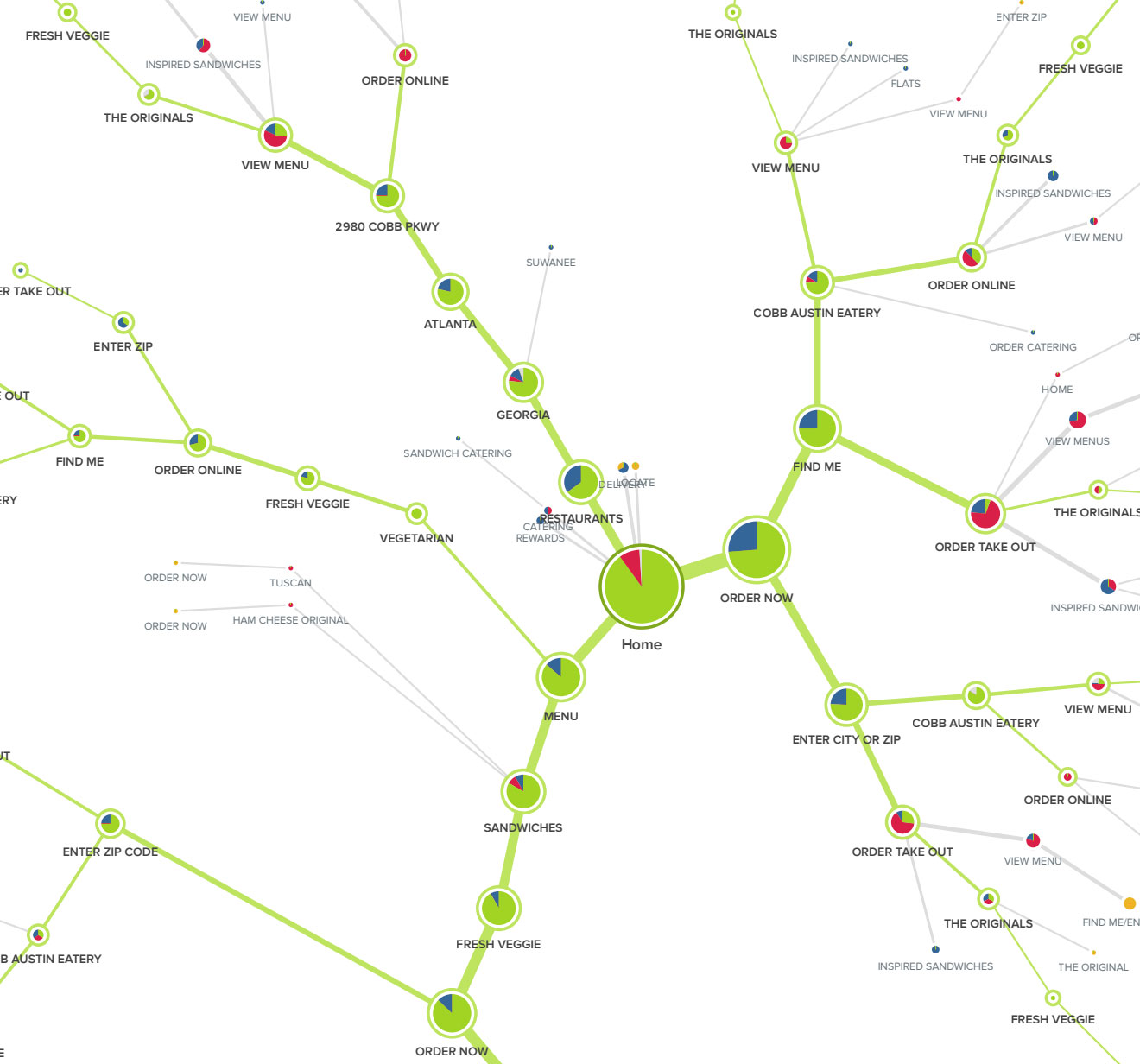
Tree Testing
While conducting Tree testing, out goal was to collect quantitative data about the Information Architecture of the main Schlotzsky's website and the olo website of Schlotzsky's. We hoped to learn about where people became lost throughout the ordering process. We sought to identify any misleading labels and confusing navigation patterns. The method is ultimately a way to inform the redesign of the website in such a way that that the organization of information is logical for our users.
Tree testing should help answer following questions:
- Is my website or intranet content hierarchy well structured?
- Is the taxonomy and navigation labelling appropriate?
- Can people find what they're looking for?
Research Findings
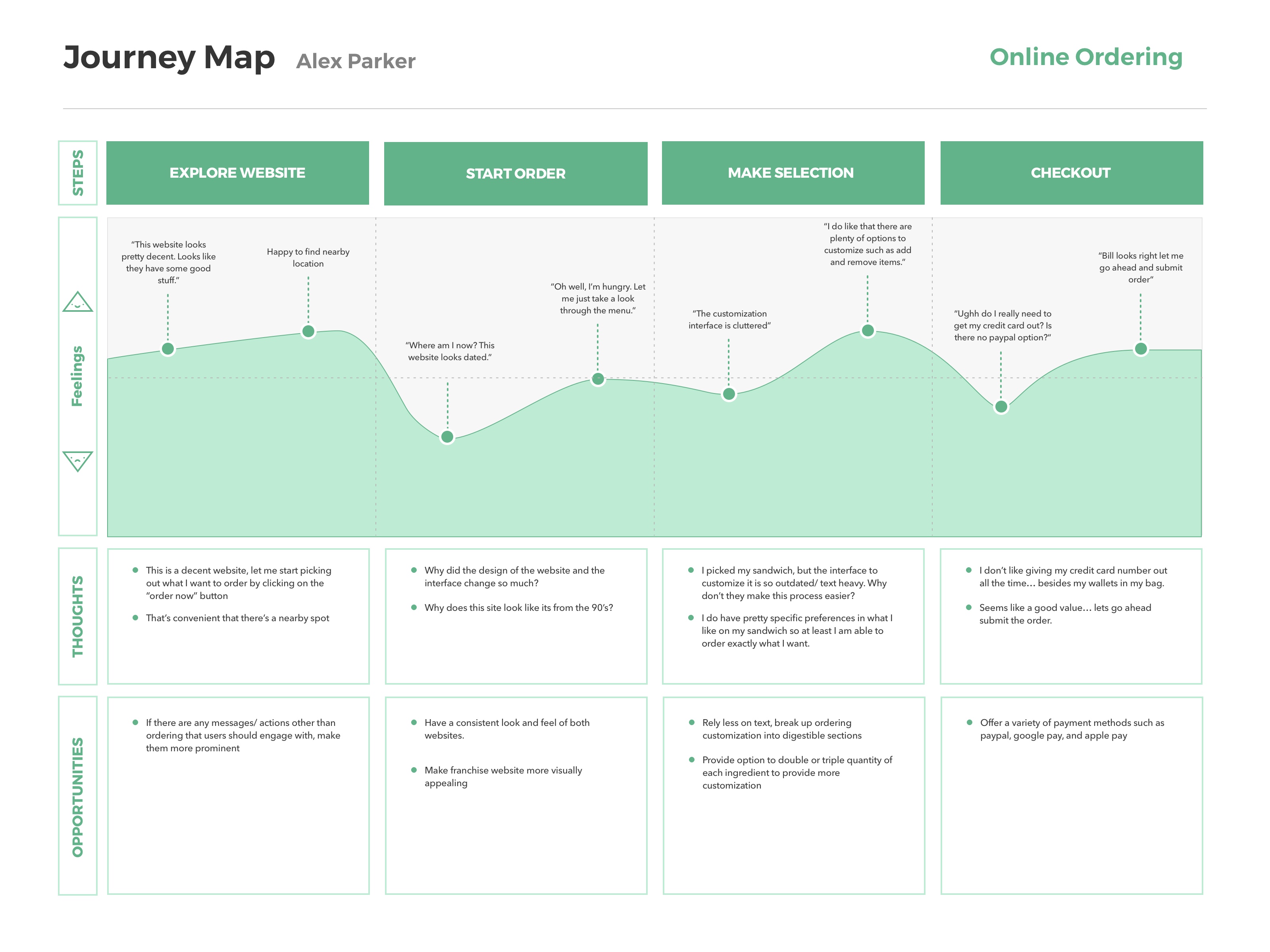
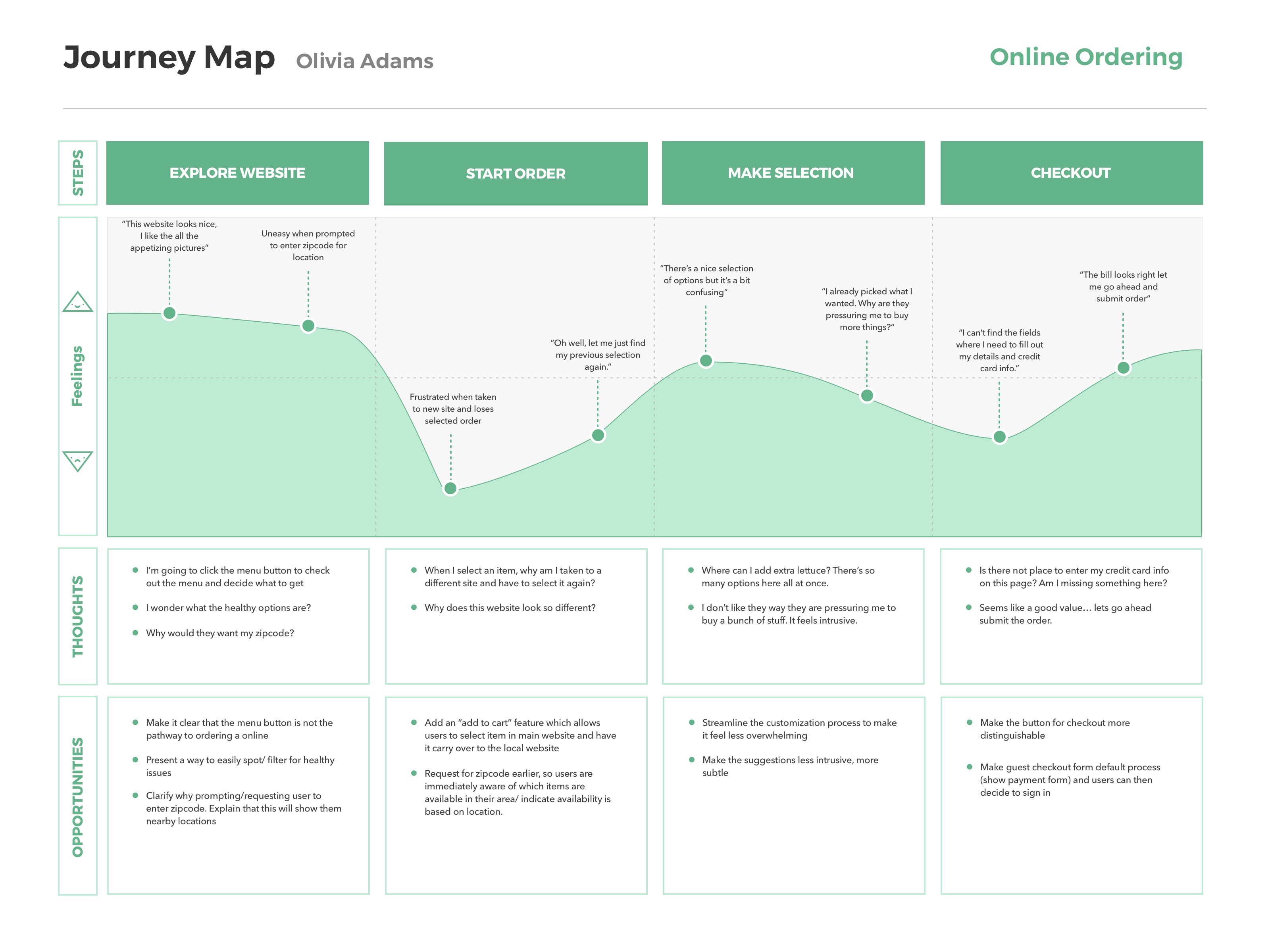
After analyzing the results from our task analysis, cognitive walkthroughs, interviews, and tree testing, we identified 9 common pain points that ran through the findings for all of the methods.
- The switch to Olo is confusing to users and disrupts the flow of completing the task.
- Users are frustrated when they lose their progress on Olo because they are not expecting it.
- Language used on Schlotzsky’s main website and Olo’s ordering page is inconsistent and too jargon-y.
- There are too many different options presented and users find it difficult to distinguish them from one another
- Customization is often useful, but is presented in a way that it is confusing.
- Users want tailored, concise suggestions at the right moment.
- Navigation is tedious and has many redundant steps and loops.
- There is no way to search or filter items.
- Appropriate Feedback is not provided
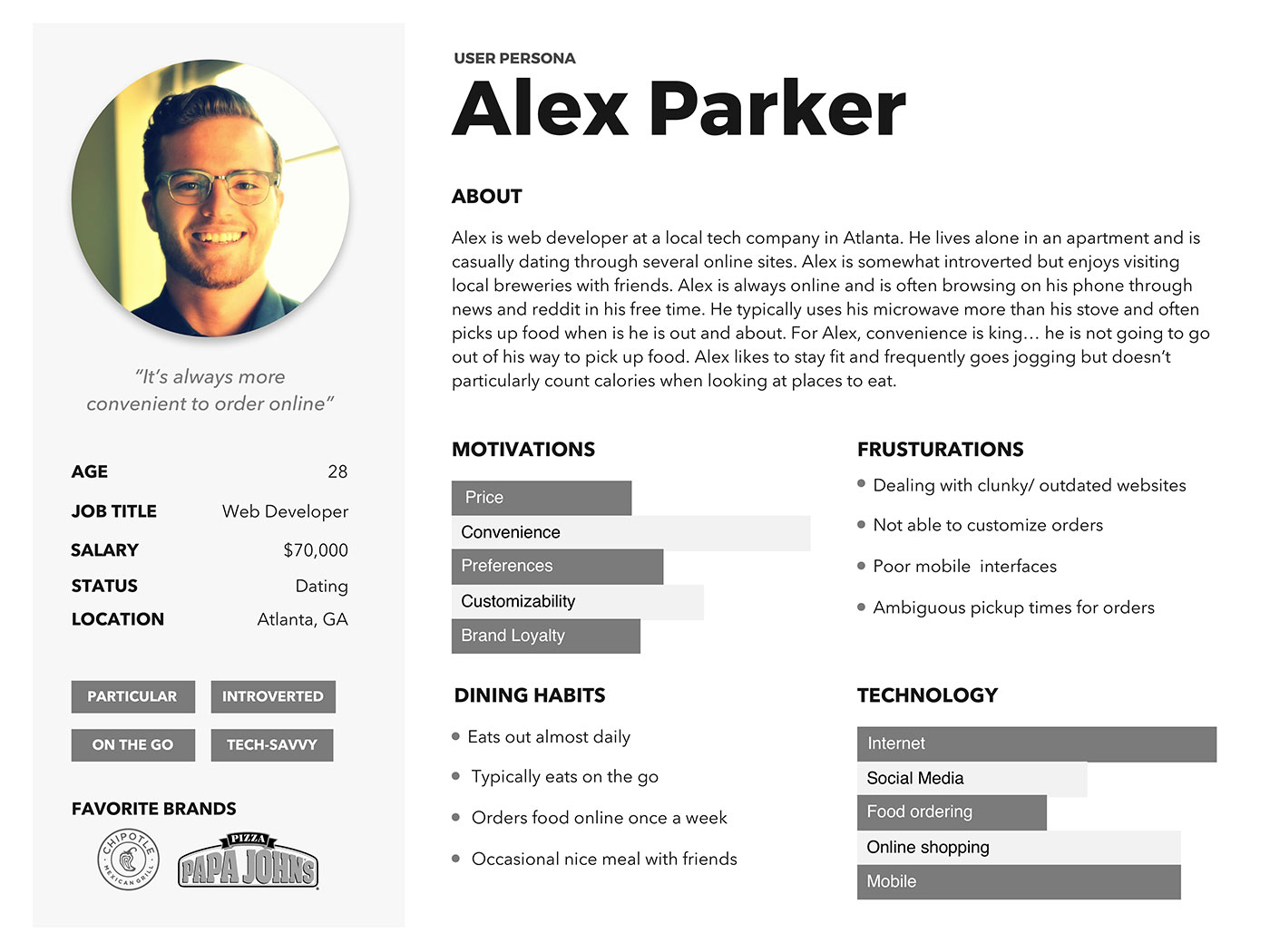
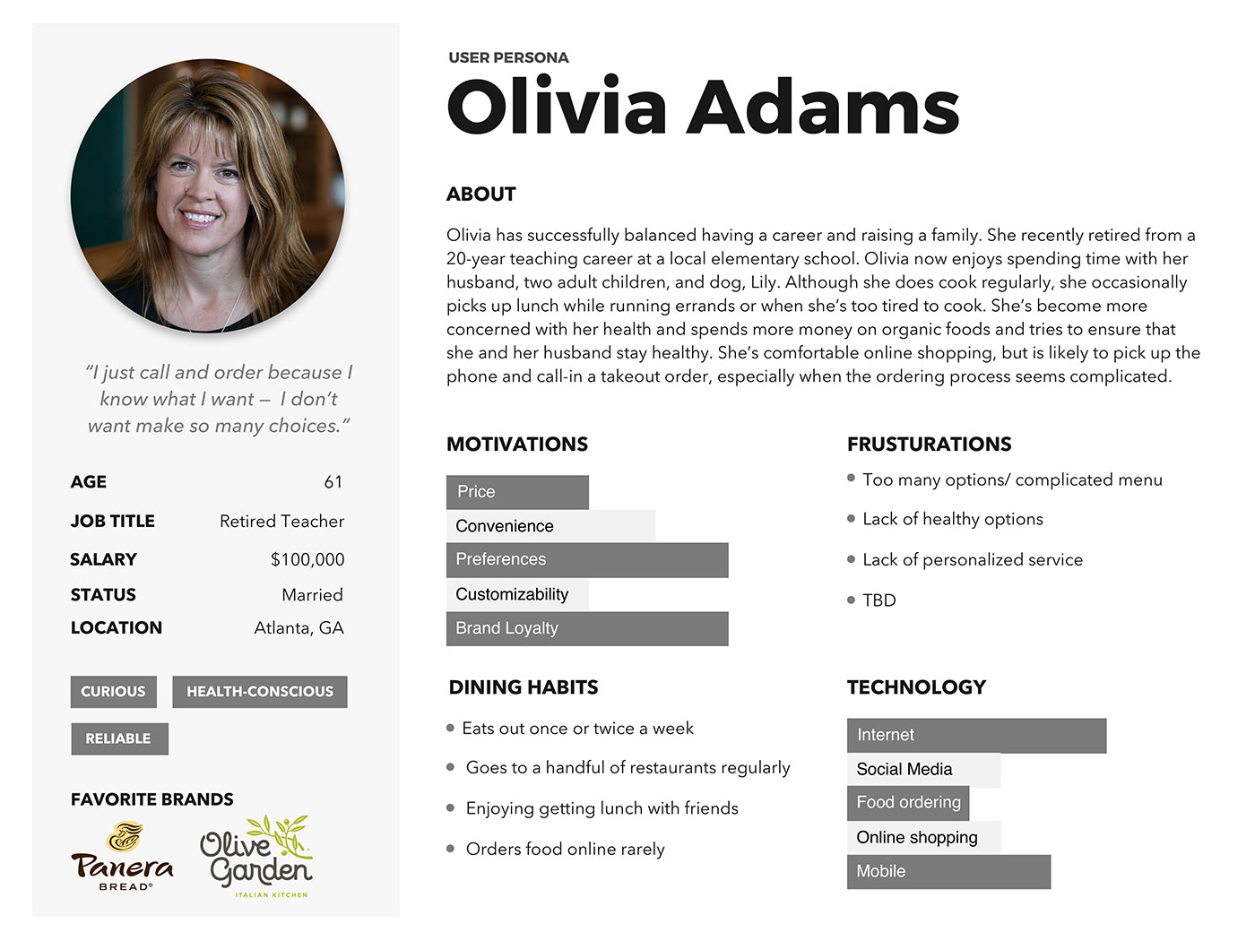
Personas
User Journeys
Design Concepts
During the design phase, we strived to incorporate insights into the design of the ordering process in order to create robust, accessible interfaces. We began this phase of the project by brainstorming three design concepts for online ordering.
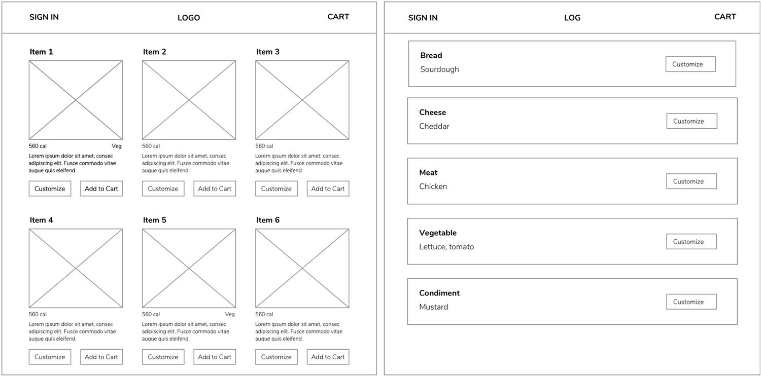
Concept #1: Website
In order to faithfully validate the accessibility of the website’s ordering process, it is essential to have fine-grained control over the code because this is is how how the interface communicates with screen readers. Therefore we opted to immediately code a barebones working prototype using web technologies to gain valuable insights from our users.
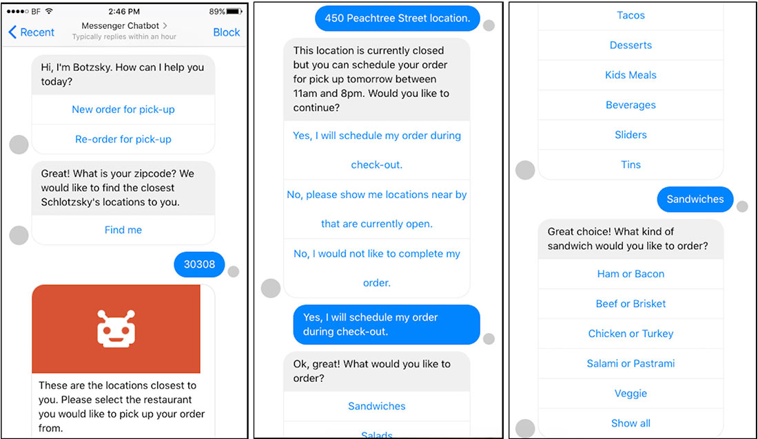
Concept #2: Chatbot
Chatbots have a great potential of being accessible interfaces because users with vision impairments can easily carry out a text conversation with a screen reader and navigate through/ select given options presented by a chatbot.
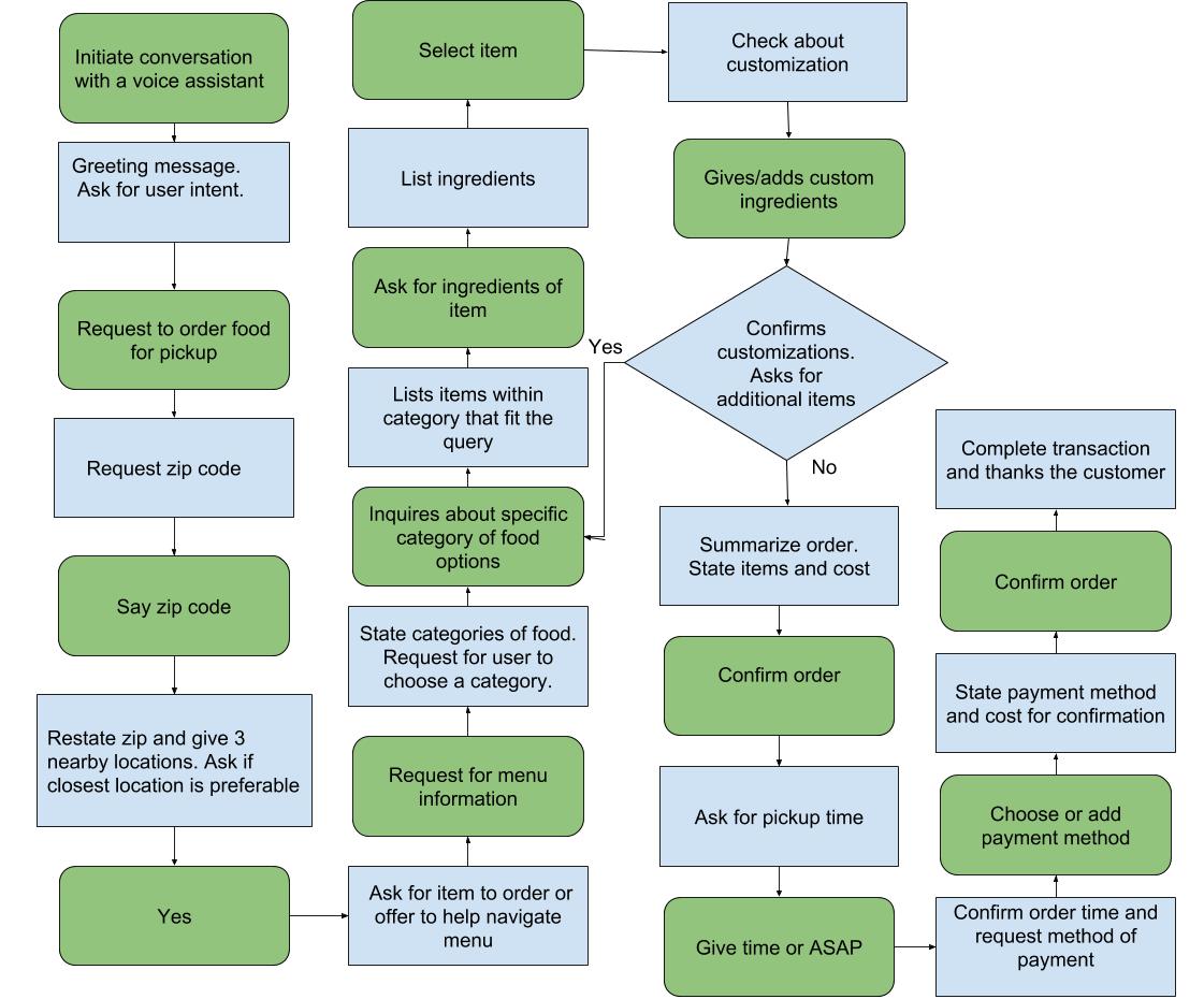
Concept #3: Voice Interface
We chose the voice interface as a design alternative from our pool of brainstormed ideas because it is accessible for those with or without vision impairments. Moreover, owing to its conversational nature, we hypothesized that customers would find it usable as it would feel similar to talking to a waiter at a restaurant.
Concept Evaluation & Findings
We took feedback from our participants and continually iterated on our design, which was critical because of our initial lack of practical understanding of people with visual impairments and how they may interact with our interfaces. We used the Wizard of Oz method to simulate the chatbot and voice interface. To test the website, we developed a prototype using a web-application framework, React.js, to quickly and accurately test the accessibility of the website with a screen reader.
Final Prototype Design & Evaluation
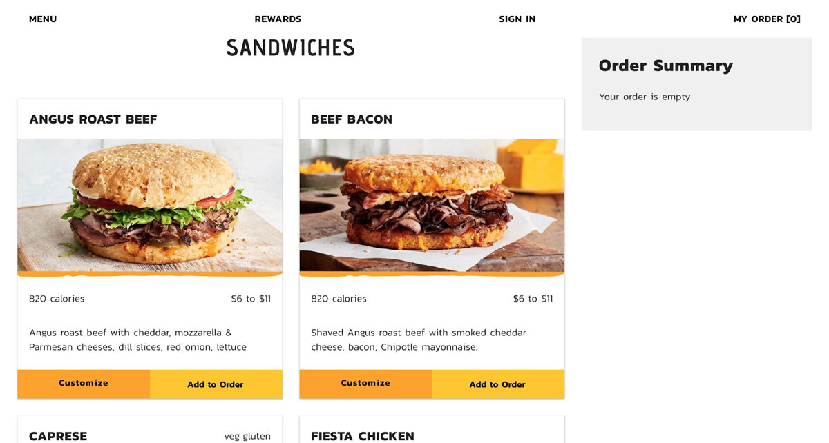
We moved forward to the next phase with the website concept. We incorporated previous research findings and expanded upon its features for the final evaluation sessions. We conducted a total of nine evaluation sessions with three experts and six users.
View Prototype
Cognitive Walkthrough
Our goal for the cognitive walkthrough was to understand the user’s expectations and information needs while ordering online from Schlotzsky’s specifically in regards to accessibility. Conducting cognitive walkthroughs also gave us a clear understanding about users’ considerations as they go through the entire online ordering process.
Heuristic Evaluation
Our goal with heuristic evaluation is to ensure that our design meets holistic usability standards. We decided to use heuristic evaluation with our usability experts because it would provide feedback on a number of aspects of our design in one feedback session. Additionally, the heuristics provided us with a framework with which we could discuss our design and references with the expert.
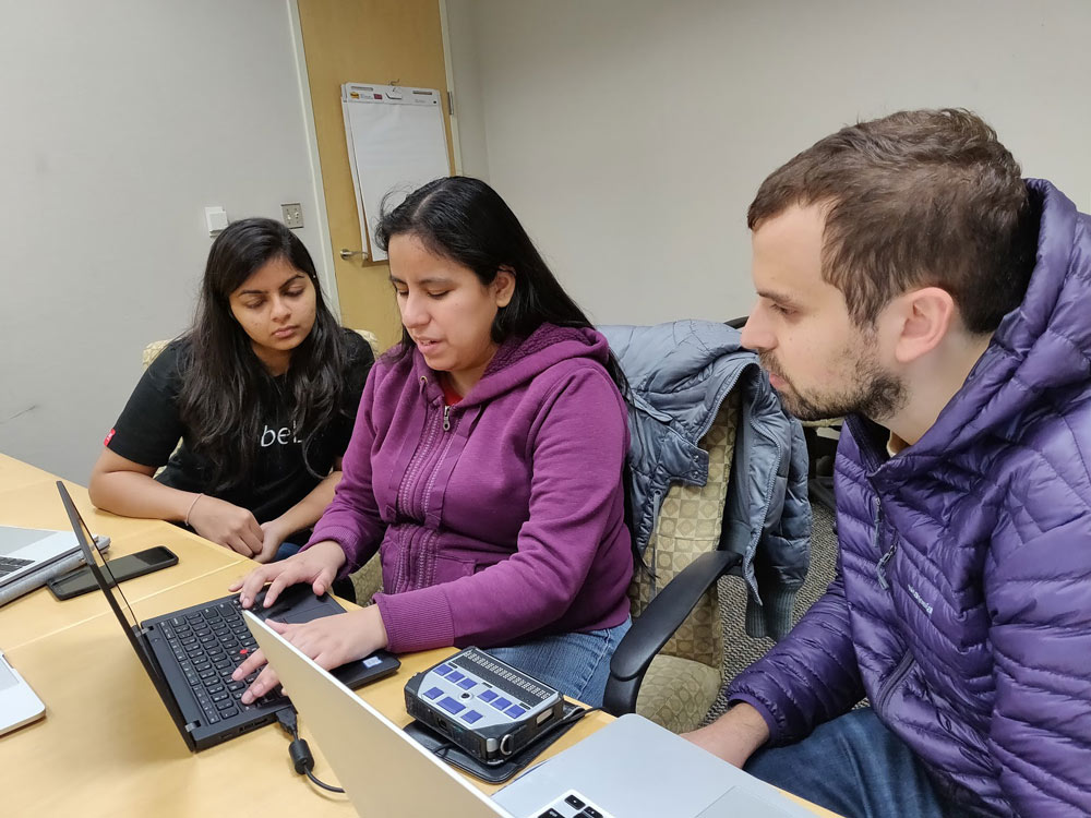
Interviewing / Think Aloud Testing
The goal of this user research method was to gain insights into the strengths and weaknesses of the interface from the perspective of a consumer. It was also critical to gain insights into how the screen reader worked in practice on participants’ with visual impairments own computers to identify any technical issues with the code. In addition, we asked more general questions about users’ online ordering preferences and habits to help us develop a baseline to understand their experience with and perception of online ordering platforms in general. We decided to pair Interviewing with think aloud testing to help fill in the gap of what the users experience throughout the ordering process.
Benchmark Testing
Our goal for benchmark testing was to compare how accessible our design is compared to one of Schlotzsky’s competitors, Hopdoddy. We chose Hopdoddy because their website was found to be the most accessible by automated testing tools during our competitive analysis of five Schlotzsky’s competitors that we previously conducted. Because we gave users the same basic task on each website (ordering an item for lunch online), we were able to see parallels and differences between the online ordering processes. We were able to see how the two websites differed in terms of how well screen readers navigated pages, links, and other web components.
System Usability Scale (SUS)
Our goal for using SUS was to obtain a baseline score of the usability of our prototype. We choose to evaluate the system with SUS because it a quick, convenient statistically-proven way to gain a sense of usability. SUS is also quite flexible because the 10 questions are able to evaluate anything from a traditional website interface to a experimental interface.
Research Findings from Evaluation
Cognitive Walkthrough
From our cognitive walkthroughs, we found that our website met overarching accessibility goals in that it is easily navigable by a variety of screen readers (it’s operable, robust) and that it is predictable and understandable in terms of language and overall structure (understandable and perceivable).
Heuristic Evaluation
We incorporated the following changes to our prototype based on the expert’s feedback, and the team’s discussion.
- Added feature for ‘Website Feedback’ at the end of the home page
- Displayed an empty cart from the initial phase of the ordering process for consistency. The cart then fills up as the user adds items.
- Removed the Promo picture from the home page to avoid distraction
- Added Favorites option to save the item for later.
Interviewing / Think Aloud Testing
- The website was intuitive and easy to use.
- Navigation through the website is intuitive and guided.
- The summaries provided throughout the website are helpful.
- I like images and colors to supplement information shown in text.
- The system should save payment information.
- Parts of customization and checkout were tedious.
Benchmark Testing
- Users prefer seeing all important details of a dish upfront (price, ingredients, dietary restrictions, etc.) as displayed in our design.
- Important interface elements should not be hidden inside menus because they are inaccessible for users with or without screen readers.
- We should incorporate personal touches like emotive language and suggestions because they draw users in.
- Users need feedback for actions that they have taken and how to navigate throughout a website. We have achieved this in our design.
- Users find it helpful to be guided through the ordering process by the design itself.
- Users find the options to customize pickup time and date and to add custom notes to a dish helpful.
System Usability Scale (SUS)
Average score: 90.83
Project Reflection
This was overall an extremely ambitious and rewarding project. Entering into the area of accessible design initially feels nearly overwhelming due to the complexities that exist within this set of users that most designers don’t really understand. The challenge of this project, however, is what largely contributed to what made it so exciting to work on. Due to the poor state of accessible design within food ordering platforms and the digital space at large, we were able to make a large impact within this space and create experiences for users that were superior to their typical alternatives.
Accessible design is only truly realized by working through the user-centered design process. We need to design for differences in abilities and offer stunning experiences no matter how users interact with an interface. Ultimately, accessible designs make intefaces more usable for everyone. When you’re designing for accessibility for those with visual impairments, you can’t fall back on visual design. This forces you to focus on information architecture at its core. Users of screen readers typically read through a website linearly so if there’s a giant list of things to read through, it becomes a mess. This forces the designer to break down the process and information into logical, digestible chunks in order to streamline the user’s experience.
Accessible design makes interfaces more usable for everyone.
